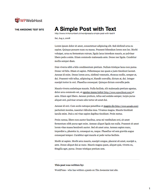
Most of your readers will probably never print any article on your blog, people now are used to reading on screen and feel comfortable with it. However, when you write a long article, or when some people want to give your article to read to a friend, they may hit the print button to have a paper version of the post.
Unfortunately, in most cases blogs offer a poor printed version of their articles, probably because the developers or designers don’t consider it worth the effort. It’s really too bad, because improving the printing experience is actually quite easy on a WordPress blog.
In this tutorial, we will take the printing of a WordPress post from a crappy level to a user-friendly level, as you can see on the following image. All this tutorial was created on my test site, modifying the FreshNews free theme.
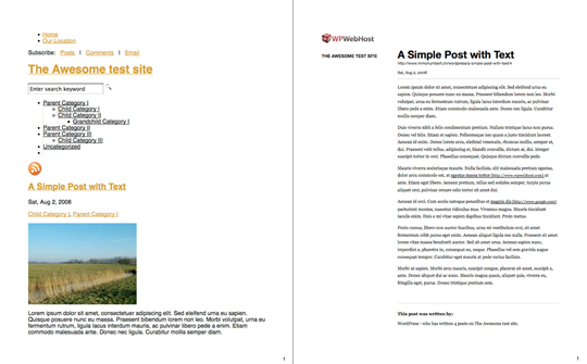
Identifying the problems
The starting point clearly presents a lot of issues to fix. First, it contains way too much unnecessary information that lead to a four pages document. The general feeling give messy impression, and all the useless data (navigation, RSS feed, tags, images,…) make the actual content hard to find.
Create the print stylesheet
As a starting point, we will add a print stylesheet to the theme. Check in your theme if you already have one, if you do work with it, if you don’t create one in your theme folder, then add the link meta tag in your header.php file.
To create the print stylesheet, I usually just copy the style.css file, so I already have all the CSS properties in place and just need to modify it.
Removing unwanted elements
The first step I always take as it allows you to see rapid progress and makes things clearer to go into details.
Start by totally deleting styles that will have no influence whatsoever, like the hover state on links or all the form elements formatting.
When you are done with that, you can start hiding elements that you don’t want to print by adding the display:none declaration. I usually do this on images (they waste ink for the user), navigation, some header elements like the feed or the search box, and basically anything you don’t want to show up. To make you CSS file smaller, you can group all the elements that use display:none into a single declaration. For example, you would have something that looks like that.
#rss, #navigation, .searchbox, #footer {display:none;}
The list will probably be much longer than that, but you get the idea.
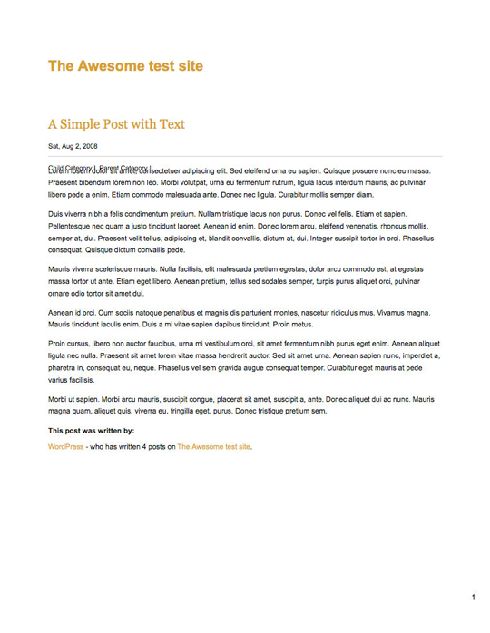
On the above image, you can see how much more readable the printed article has become. Everything fits on one page and the clutter is gone. There are still a few bugs and the layout isn’t very attractive, so we’ll fix that.
Lay out the elements
The layout is a bit boring for now and lacks some proper space, I will then try to give the elements on the page a better arrangement. Printed CSS is even more limited technically than CSS for web pages, so it will hard to do real graphic design, but I will at least try to give better white space and design.
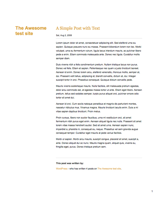
As you can see, I moved the blog’s title on the left and the content on the right, on about two-thirds of the page. All the changes were made using the position, float, margin, padding and border properties.
The code for our example goes as follows.
/* POSITIONNING */
#header{height: 109px;}
#header h1{position:relative;margin-top:70px;float: left;width:27%;}
h2{position:relative;float:right;width:68%;margin: 0 0 25px;}
h3, h4, h5{margin: 0 0 5px;}
.date-comments{position:relative;float:right;width:68%;border-bottom: 1px solid #cacaca;margin-top:-30px !important;padding-bottom:10px;height: 30px;}
.singleh2 {padding-top:5px;margin-top:-60px;}
.entry {position:relative;float:right;width:68%;margin-bottom:5px;}
.author_info {position:relative;float:right;width:68%;padding: 0px;padding-bottom:10px;margin-top:30px;padding-top:20px;border-top:1px solid #ddd;}
.author_info p {padding:0px;margin-bottom:10px;}
Typography, color and links
Printed design has different requirements than the screen designs in terms of typography, on screen readability is better if you use a sans-serif font, on paper serif fonts are more readable. It might also be worth changing some of the colors used on the web design, for example it is useless to keep color for links. Links should be underlined, and the URL should be added in plain text after the text.
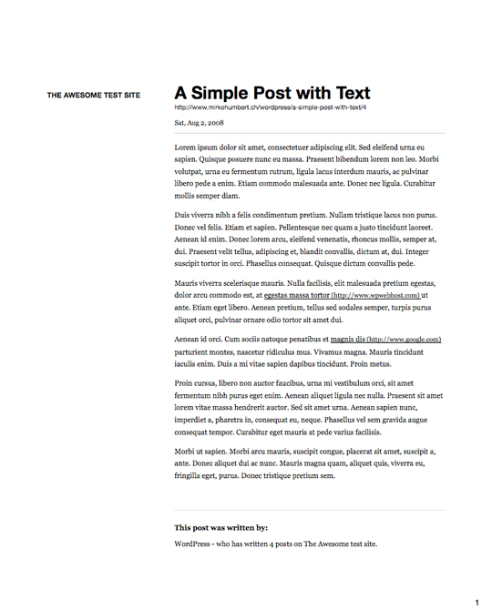
As you can see, I have added the link URL after the title. For that I used the following code.
h2 a:link:after, h2 a:visited:after {content:"a"attr(href);}
I also added underlines for links with the URL following it, removed the color and changed the font families for the titles and texts.
The CSS code for the typography, color, and links goes as follow in our example.
/* TYPOGRAPHY - COLOR - LINKS */
body{font: 12px Georgia, Times, "Time New Roman",Serif;font-size:12pt;}
a{color: #000;text-decoration: none;}
#header h1{font-family: "Helvetica Neue", Helvetica, Arial, Verdana, serif;font-size:9pt;text-transform:uppercase;color:#555 !important;}
#header h1 a {color:#555;}
h2{color: #000000;font: 18px "Helvetica Neue", Helvetica, Arial, Verdana, serif;font-size:18pt;font-weight:bold;}
h2 a {color:#000;}
h2 a:link:after, h2 a:visited:after {content:"a"attr(href);font-size: 8pt;color:#555;text-decoration:none;text-transform: lowercase;clear:both;font-weight:normal;}
h3, h4, h5{color: #363636;font-size: 12px;font-weight: bold;}
.date-comments{color: #999999;font-size: 11px;line-height: 25px;}
.date-comments a {color:#000;}
.singleh2 {font-size:1.8em !important;}
.entry p {text-align:left;font-size:12px;line-height:20px !important;}
.entry p a {color:#000;text-decoration:underline;}
.entry p a:link:after, .entry p a:visited:after {content: " (" attr(href) ") ";font-size: 90%;color:#555;text-decoration:none;}
.author_info {color:#666666;}
.author_info a {color:#000;}
.author_info p {font-size:12px;}
Adding a logo that appears only at printing
We can now be pretty satisfied with the layout, at least I am. However, there is a little branding element missing, it would indeed be nice to have a small logo appearing on the printed document.
For the sake of the example, we will add WP WebHost’s logo to brand the article. To proceed, you need to start by adding the hidden logo to your theme. For that, just add the image to your header.php file (or elsewhere if you want your logo in another area of the site) and give it an id named “hiddenlogo”.
Once this is done, add the following line to your style.css (or your stylesheet, whatever it is named).
#hiddenlogo {display:none;}
In your print stylesheet (print.css), you can then add the following.
#hiddenlogo {position:relative;float:left;display:block;margin:-10px 0 0 -180px !important;width:150px;height:75px;}

As you can see on this image, the result is much more pleasant to read. All those changes are also actually quite quick to do, so you should really pay attention to this kind of details in your WordPress theme.
Download the example files
